Apache MyFaces
By Dan Troesser, OCI Principal Software Engineer
July 2005
Introduction
JavaServer Faces (JSF) is Sun's latest technology intent on making web development easier. It was first released March 3, 2004 and was rolled into the fold of J2EE technologies. JSF is a framework built upon Java Servlets and JavaServer Pages (JSPs) technologies to provide a better Model-View-Controller (MVC) architecture. It makes extensive use of user interface components, JavaBeans, and events such that user interface development is more similar to frameworks like Swing.
Since its release, JSF is gaining momentum in the web development community. The Apache Software Foundation has jumped on board also and has created their own open source implementation of JSF, called MyFaces. MyFaces provides much more than just a fully compliant implementation of JSF. This article will take a look at MyFaces and discuss some of the features it provides that are above and beyond what is provided by the standard reference implementation from Sun.
To learn more about JSF and its architecture, visit the August 2003 Java News Brief, An Introduction to JavaServer Faces. The August 2003 Java News Brief was written before the JSF specification was finalized. The names and attributes of the JSF tags used in the example have changed. However, the rest of the article is still valid.
MyFaces Overview
MyFaces is very new. It was released just this past April and will obviously improve as time passes. However, it already packs a punch in terms of features. Its features include:
- A fully compliant JSF implementation
- A collection of useful custom components and validators that can be used in conjunction with the default JSF components and validators
- WAP tags for generating Wireless Markup Language (WML) pages
- Portlet support
- Tiles support for easier integration with Struts
- Compatibility with JDK 1.4 and 1.5 and many Servlet/J2EE containers
While all of the features are interesting, this article will focus on the custom components and validators as they will likely find the most appeal with the average web developer.
Installation
Using MyFaces is fairly straight-forward for those familiar with Java web development. Follow the steps outlined below to begin using MyFaces in a web application.
- Download Tomcat 5.x or fire up a J2EE compliant application server
- Download
MyFacesfrom http://myfaces.apache.org - Add the following JAR files from the
MyFacesdistribution to theWEB-INF/libfolder of the web application (current as ofMyFacesversion 1.0.9(m9))commons-beanutils-1.6.1.jarcommons-codec-1.2.jarcommons-collections-3.0.jarcommons-digester-1.5.jarcommons-el.jarcommons-fileupload-1.0.jarcommons-logging.jarcommons-validator.jarjakarta-oro.jarmyfaces.jar
- Configure the deployment descriptor (web.xml) for
MyFaces. A simple deployment descriptor (and the one used for the examples in this article) can be found here. - Create a
faces-config.xmlfile and place it in theWEB-INFfolder. An emptyfaces-config.xmlcan be found here. This file will grow as more JSF pages are created. This article touches on some of what goes in this file. A Web search or a JSF book will tell much more. - Note: JSPs containing JSF tags cannot be accessed the same way as normal JSPs. The request must go through the Faces Servlet so the URL must be adjusted slightly. See the first example below for more detail.
To try out the examples in this article or study them in more detail, download MyFacesExamples.war.
Custom Components
While the default components provided with the JSF distribution are useful and arguably sufficient, developers are always looking for something better that increases efficiency. The custom components included with MyFaces do just that. They can work side by side with the default components and any other custom JSF components, giving the developer a richer set of components to choose from. Some of the interesting MyFaces component tags are listed below.
x:dataList- similar to
dataTableexcept it renders a simple, unordered, or ordered list x:dataScroller- renders a scroller allowing the user to page through a
dataTable, showing a specified number of rows at a time x:dataTable- an improved version of the standard
dataTabletag providing sorting capability x:inputDateandx:inputCalendar- renders a date input control and/or a calendar to assist in selecting a date
x:inputFileUpload- renders a file upload component
x:inputHtml- an inline HTML-based word processor based on the Kupu library
x:jscookMenu- renders a JavaScript menu based on the JSCookMenu by Heng Yuan; mimics complex drop-down menus used in popular GUI applications
x:panelLayout- allows dynamic page layout control
x:panelNavigation- renders a hierarchical (vertical) navigation menu and remembers its open/closed/active state over different pages
x:panelTabbedPane- presents a collection of panels organized by tabs; selecting a panel's tab displays the panel; only one panel is visible at any given time
x:popup- renders a popup (similar to a tooltip) which displays on a mouse event
x:rssTicker- retrieves and displays an RSS feed for a specific URL
x:selectOneCountry- renders a choose box with a list of countries
x:treeandx:tree2- renders two different styles of an expandable/collapsible tree view similar to the Folders view in Microsoft™ Windows Explorer
While it would be great to discuss each of these component tags in detail, it would cause this article to be much longer than intended. However, it is desirable to see the tags in action, so examples of a few of the tags will be shown below.
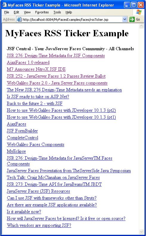
RSS Ticker
The RSS Ticker allows developers to embed or display RSS feeds in their web application. The following example displays JSF Central's RSS feed.
Note the /faces in the URL. This is the virtual path mapping to the Faces Servlet.
The deployment descriptor (web.xml) listed in the installation instructions defines the mapping to the Faces Servlet. All JSPs using JSF tags must be accessed through the Faces Servlet.
An alternative to the virtual path mapping configuration is the extension mapping configuration whereby JSPs with JSF tags are accessed by replacing the .jsp extension with a .jsf extension.
For example, if using the extension mapping configuration, the above URL would be http://localhost:8084/MyFacesExamples/rssTicker.jsf
rssTicker.jsp
- <%@ taglib uri="http://java.sun.com/jsf/html" prefix="h"%>
- <%@ taglib uri="http://java.sun.com/jsf/core" prefix="f"%>
- <%@ taglib uri="http://myfaces.apache.org/extensions" prefix="x"%>
- <html>
- <head><title>MyFaces RSS Ticker Example</title></head>
- <body>
- <h1>MyFaces RSS Ticker Example</h1>
- <f:view>
- <h:panelGrid columns="1">
- <x:rssTicker rssUrl="http://www.jsfcentral.com/jsfcentral.rss"></x:rssTicker>
- </h:panelGrid>
- </f:view>
- </body>
- </html>
The first two lines of the JSP are standard JSF taglib declarations which allow use of JSF tags. The third taglib declaration allows use of the MyFaces custom tags and gives the tags the recommended prefix, x. The x:rssTicker tag is easy to use. As the name implies, the rssUrl attribute specifies the URL for the RSS feed. The other tags surrounding x:rssTicker are standard JSF tags. All JSF tags are required to be within the f:view tag. h:panelGrid renders an HTML table.
Dates and Calendars
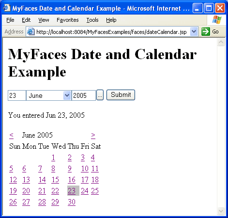
MyFaces improves on the standard JSF tags for entering and displaying dates, especially when one uses their calendar capabilities. The following example allows the user to enter a date. When the Submit button is pressed, the date is shown on a calendar.
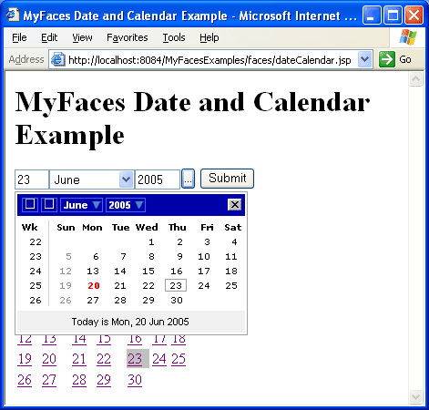
When the '...' button is pressed, a popup calendar appears, giving the user assistance in selecting the date.
JSF components are usually associated with a JavaBean, especially those taking input from the user. The associated JavaBean is considered the model in the Model-View-Controller architecture pattern used by JSF. A user interface with associated, but distinct, JavaBeans allows for a cleaner separation between the model and the view. The JGoodies Binding API accomplishes this for Swing user interfaces as discussed in the June 2005 SETT Article.
The date and calendar example uses a single JavaBean to store and redisplay the selected date. Since only a date is stored, java.util.Date could have been used directly, which is Ok because it is a JavaBean. However, for illustration purposes, a JavaBean class was created to store the date. Keep in mind backing beans usually contain additional fields and methods because usually more values are shown or taken as input in the JSP.
DateBean.java
- package com.ociweb.jnb;
-
- import java.io.Serializable;
- import java.util.Date;
-
- public class DateBean implements Serializable {
-
- private Date date = new Date();
-
- public Date getDate() {return date;}
-
- public void setDate(Date date) {this.date = date;}
- }
To use it as a bean in the page, an entry needs to be added to the faces-config.xml file. The faces-config.xml file stores project-specific JSF configuration information. Developers can optionally name this file whatever they choose, if they specify otherwise in the deployment descriptor (web.xml file).
Portion of faces-config.xml
- <managed-bean>
- <managed-bean-name>dateBean</managed-bean-name>
- <managed-bean-class>com.ociweb.jnb.DateBean</managed-bean-class>
- <managed-bean-scope>session</managed-bean-scope>
- </managed-bean>
The JSP can then use the bean by its managed-bean-name.
dateCalendar.jsp
- <%@ taglib uri="http://java.sun.com/jsf/html" prefix="h"%>
- <%@ taglib uri="http://java.sun.com/jsf/core" prefix="f"%>
- <%@ taglib uri="http://myfaces.apache.org/extensions" prefix="x"%>
- <html>
- <head>
- <title>MyFaces Date and Calendar Example</title>
- <link rel="stylesheet" type="text/css" href="styles.css"/>
- </head>
- <body>
- <h1>MyFaces Date and Calendar Example</h1>
- <f:view>
- <h:form>
- <x:inputDate value="#{dateBean.date}" popupCalendar="true"></x:inputDate>
- <h:commandButton value="Submit"></h:commandButton>
- <p>You entered <h:outputText value="#{dateBean.date}"></h:outputText></p>
- </h:form>
- <h:form>
- <x:inputCalendar value="#{dateBean.date}"
- currentDayCellClass="currentDay"></x:inputCalendar>
- </h:form>
- </f:view>
- </body>
- </html>
The page uses two forms. Neither of the forms specify an action or target page so the default behavior will show the same page again, but with a possibly updated date.
The first form contains the x:inputDate tag, which displays the first date input component shown in the above browser snapshot. The value attribute specifies the initial value to set when rendered for the first time. It also specifies where to store the entered date. #{dateBean.date} is an expression language (EL) expression accessing the dateBean's date property. Specifying true for the popupCalendar attribute adds the '...' button, which shows the calendar when pushed.
The second form contains the x:inputCalendar tag rendering the HTML calendar. The value attribute again accesses the dateBean's date property. However, unlike the x:inputDate tag, the initial value is always updated, not just when rendered for the first time. The currentDayCellClass attribute specifies the cascading style sheet (CSS) class used for the current day (i.e. the day stored in dateBean's date property). If the current day is not styled differently, users can't tell which is the current day as the default is to render with the same style as all the other days of the month. The currentDay CSS class simply specifies a silver background.
styles.css
- .currentDay {
- background-color: silver;
- }
Using other attributes of the x:inputCalendar tag, the calendar can be made more visually appealing by applying additional styles.
Custom Validators
In addition to custom components, MyFaces also provides custom validators. These include:
x:validateCreditCard- validates credit card format for American Express, Discover, Mastercard, and/or Visa
x:validateEmail- validates e-mail addresses
x:validateEqual- validates a value is equal to another component's value; e.g., when the user must enter their email address or password twice
x:validateISBN- validates International Standard Book Number (ISBN) codes
x:validateRegExpr- validates input against a specified regular expression
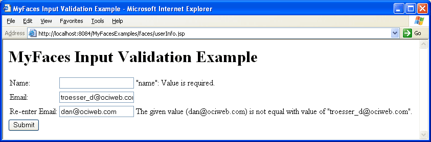
The final example illustrates the use of a few of these validators. If the user is presented with the following form, enters the values shown, and clicks Submit, the validation errors shown to the right of the fields will appear.
The backing bean for this form is below.
UserInfo.java
- package com.ociweb.jnb;
-
- import java.io.Serializable;
-
- public class UserInfo implements Serializable {
-
- private String name;
- private String email;
-
- public String getName() {return this.name;}
- public void setName(String name) {this.name = name;}
-
- public String getEmail() {return this.email;}
- public void setEmail(String email) {this.email = email;}
- }
The JSP is given access to the bean via the following entry in faces-config.xml.
- <managed-bean>
- <managed-bean-name>userInfo</managed-bean-name>
- <managed-bean-class>com.ociweb.jnb.UserInfo</managed-bean-class>
- <managed-bean-scope>session</managed-bean-scope>
- </managed-bean>
The JSP for this example is below.
userInfo.jsp
- <%@ taglib uri="http://java.sun.com/jsf/html" prefix="h"%>
- <%@ taglib uri="http://java.sun.com/jsf/core" prefix="f"%>
- <%@ taglib uri="http://myfaces.apache.org/extensions" prefix="x"%>
- <html>
- <head>
- <title>MyFaces Input Validation Example</title>
- <link rel="stylesheet" type="text/css" href="styles.css"/>
- </head>
- <body>
- <h1>MyFaces Input Validation Example</h1>
- <f:view>
- <h:form>
- <h:panelGrid columns="3">
- <h:outputLabel for="name" value="Name: "></h:outputLabel>
- <h:inputText id="name" value="#{userInfo.name}" required="true"></h:inputText>
- <h:message for="name"></h:message>
-
- <h:outputLabel for="email1" value="Email: "></h:outputLabel>
- <h:inputText id="email1" value="#{userInfo.email}" required="true">
- <x:validateEmail></x:validateEmail>
- </h:inputText>
- <h:message for="email1"></h:message>
-
- <h:outputLabel for="email2" value="Re-enter Email: "></h:outputLabel>
- <h:inputText id="email2" value="#{userInfo.email}" required="true">
- <x:validateEqual for="email1"></x:validateEqual>
- </h:inputText>
- <h:message for="email2"></h:message>
- </h:panelGrid>
- <h:commandButton value="Submit"></h:commandButton>
- </h:form>
- </f:view>
- </body>
- </html>
As mentioned earlier, the h:panelGrid component is a standard JSF component that renders an HTML table. In this example, three columns are specified. h:panelGrid will fill the HTML table cells from left to right with the components it contains, creating rows as necessary when the specified number of columns is reached.
h:outputLabel renders an HTML label element. h:inputText renders an HTML text input field. h:inputText is given an ID so that other components/tags can reference it. The ID is referenced by the for attribute of the h:outputLabel preceding it and the for attribute of the h:message following it. The h:message tag outputs any validation error messages for the component it references. The h:inputText's required attribute indicates the field must contain a value. This is what caused validation to fail for the name field in the above browser screenshot.
Validators are applied to an input value by adding the validator tag as a child element of the input component tag. As shown above, x:validateEmail and x:validateEqual are children of h:inputText tags. The x:validateEqual tag validates that the component referenced in the forattribute has the same value as the component for which it is a part. In the above example, email2 must be equal to email1. This is what caused validation to fail for the email2 field in the above browser screenshot.
Summary
This article just scratched the surface of what MyFaces and JSF can do. It included a look at some of the standard JSF components and just a few of the interesting custom components and validators provided by MyFaces. The examples also showed that because of JSF's component-centric approach, one can pay much less attention to details of the protocol (e.g. HTTP) such as the request, the response, and request parameters.
Interest and momentum in JSF is increasing, further evidenced by the fact that many IDE developers are adding or improving JSF support. If interested in web development, the reader is strongly encouraged to check out MyFaces and/or JSF in more detail.
References
- [1] JavaServer Faces
http://java.sun.com/j2ee/javaserverfaces/ - [2] Apache MyFaces
http://myfaces.apache.org/ - [3] JSF Central
http://www.jsfcentral.com/ - [4] An Introduction to JavaServer Faces
Software Engineering Tech Trends (SETT) is a regular publication featuring emerging trends in software engineering.
