Web Development Simplified with Svelte
By Mark Volkmann, OCI Partner and Principal Software Engineer
July 2019
What Is Svelte?
Svelte is an alternative to web frameworks like React, Vue, and Angular. Like its counterparts, Svelte can be used to build entire web apps. It can also be used to create custom elements that can be used in existing web apps implemented with other frameworks.
Svelte was developed by Rich Harris, who formerly worked at The Guardian and is currently at The New York Times. Harris previously created the Ractive web framework, which is used at The Guardian and inspired parts of Vue. Harris also created the Rollup module bundler, which is an alternative to Webpack and Parcel.
Svelte has not yet received the attention it deserves. When it is mentioned, the focus is typically on its ability to produce bundled code that is significantly smaller than the alternatives. However, Svelte makes many tasks easier, including defining components, managing component state, managing application state, and adding animation.
This article provides a thorough introduction to Svelte and walks you through the fundamentals necessary to start building web applications with it.
Why Consider Svelte?
Svelte apps have smaller bundle sizes than equivalent apps created with other web frameworks. This is achieved by compiling the application code to a single, optimized JavaScript file that includes a very small amount of framework code.
Svelte is a web application compiler implemented in TypeScript. It is not a runtime library.
For example, the Todo app presented later has a bundle size that is 13% of the size of an equivalent React app. These apps can be found here and here.
This website catalogs statistics on building real-world web applications using many web frameworks. The reported gzipped app sizes in KBs for some popular choices include:
- Angular + ngrx: 134
- React + Redux: 193
- Vue: 41.8
- Svelte: 9.7
Some web frameworks, including React and Vue, use a virtual DOM to optimize rendering changes. When components re-render, the framework builds a new version of the DOM in memory and then compares it to the previous version. Only the differences are applied to the actual DOM.
While this is faster than updating everything in the actual DOM, it does take time to build a virtual DOM and compare it to the previous one.
Svelte provides reactivity without using a virtual DOM. It does this by tracking changes to top-level component variables that affect what each component renders and only re-rendering those parts of the DOM when changes are detected. This contributes to good performance.
Svelte dramatically simplifies component and application state management. Contributing features include context, stores, and module context, each of which is covered in detail later.
Svelte provides runtime warnings for accessibility issues. For example, <img> elements that have no alt attribute are flagged.
Svelte does not currently support using TypeScript, but work to add this is underway.
Svelte Native supports developing mobile apps. It builds on NativeScript.
Does Svelte Disappear?
Some say that Svelte disappears once an app is built.
The Svelte library is mostly defined by .js files in the node_modules/svelte directory. The main functions are defined in internal.js, which is currently around 1,400 lines of code.
Other library files are used for specific features. These include:
easing.jsmotion.jsregister.jsstore.jstransition.js
Entering npm run build produces files in the public directory, including bundle.js. Svelte library functions that are used by the app are copied to the top of bundle.js. In the case of the Todo app shown later, this is approximately 500 lines of code.
So Svelte library code doesn’t disappear; it is just very small compared to other web frameworks.
Important Resources
Here is a list of important resources to check out when learning Svelte:
- Rethinking Reactivity
This is a talk by Rich Harris at You Gotta Love Frontend (YGLF) Code Camp 2019. It describes the motivations behind Svelte 3 and provides a brief introduction. - Svelte home page – https://svelte.dev
- Svelte tutorial – https://svelte.dev/tutorial
- Svelte API – https://svelte.dev/docs
- Svelte examples – https://svelte.dev/examples
- Online Svelte REPL – https://svelte.dev/repl
This is great for trying small amounts of Svelte code. It can also display generated code and save code for sharing and submitting issues. - Svelte blog – https://svelte.dev/blog
- Discord chat room – https://discordapp.com/invite/yy75DKs
- Svelte GitHub repository – https://github.com/sveltejs/svelte
Getting Started
Let's walk through the steps to create and run a Svelte application.
1. Install Node.js from https://nodejs.org.
- This installs the
node,npm, andnpxcommands.
2. npx degit sveltejs/template app-name
- Rich Harris created the
degittool to simplify project scaffolding. It downloads a git repo, by default the master branch. In this case "sveltejs" is the user name and "template" is the repo. The second argument is the name of the directory to create.
3. cd app-name
4. npm install
5. npm run dev
- This starts a local HTTP server and provides live reload, unlike
npm run start, which omits live reload. Syntax errors are reported in the window where this is running, not in the browser. This happens because Svelte doesn’t produce a new version of the app if there are errors.
6. Browse localhost:5000
- This just outputs "Hello world!" in purple.
Now you are ready to start modifying the app.
A peek at the package.json file reveals two things. The first is that Svelte uses Rollup by default for module bundling. If desired, it can be changed to use Webpack or Parcel. The second is that Svelte apps have no required runtime dependencies, only devDependencies.
The most important starting files are:
public/index.htmlsrc/main.jssrc/App.svelte
These files use tabs for indentation, but the tabs can be replaced by spaces if preferred.
1. The file public/index.html contains the following:
- <!DOCTYPE html>
- <html>
- <head>
- <meta charset="utf8" />
- <meta name="viewport" content="width=device-width" />
- <title>Svelte app</title>
- <link rel="icon" type="image/png" href="favicon.png" />
- <link rel="stylesheet" href="global.css" />
- <link rel="stylesheet" href="bundle.css" />
- </head>
- <body>
- <script src="bundle.js"></script>
- </body>
- </html>
Note how this pulls in two CSS files and one JavaScript file.
global.cssholds CSS that can affect any component.bundle.cssis generated from the CSS in each component.bundle.jsis generated from the JavaScript and HTML in each component and any other JavaScript in the app.
2. The file src/main.js contains the following:
import App from './App.svelte';

const app = new App({
  target: document.body,
  props: {
    name: 'world'
  }
});

export default app;
This renders the App component. The target property specifies where the component should be rendered. For most apps this is the body of the document.
The name prop is passed to the App component.
Typically the topmost component does not need props and the props property here can be deleted.
3. The file src/App.svelte contains the following:
<script>
  export let name;
</script>

<style>
  h1 {
    color: purple;
  }
</style>

<h1>Hello {name}!</h1>
Exported variables can be set as props in files that use the component.
Curly braces are used to output the value of a JavaScript expression. This is referred to as interpolation. As we will see later, curly braces are also used for dynamic attribute values.
Defining Components
Popular web frameworks use different kinds of JavaScript containers to define components.
- Angular uses classes.
- React uses functions or classes.
- Vue uses object literals.
Svelte doesn't use any kind of JavaScript container.
A Svelte component is defined by a .svelte file that contains JavaScript code, CSS, and HTML. These are combined to form the component definition, which automatically becomes the default export.
The .svelte files can be anywhere under the src directory. They contain the following three sections, all of which are optional.
<script>
  // Scoped JavaScript goes here.
</script>

<style>
  /* Scoped CSS rules go here. */
</style>

<!-- HTML to render goes here. -->
Note the different comment syntax that can be used in each section.
Component Names
Svelte component definitions do not specify a component name. The component name is not provided inside a source file by a class name, function name, or property value like in other frameworks; it is associated when a .svelte file is imported, and it must start with an uppercase letter.
Lowercase names are reserved for predefined elements like those provided by HTML and SVG.
For example:
// Somewhat confusing
import AnyNameIWant from './some-name.svelte';

// Less confusing
import SameName from './SameName.svelte';
Sharing Data
There are four ways to share data between Svelte components.
- 1. Props
- These pass data from parent components to child components.
- 2. Contexts
- These allow ancestor components to make data available to descendant components.
- 3. Stores
- These store data outside any component and make it available to all of them.
- 4. Module Scope
- These store data in component modules and make it available to all instances of the component.
These built-in approaches are so useful that there is really no need for state management libraries.
Props
Components can accept input through props. They are specified as attributes on component elements rendered by parent components.
For example, a parent component can do this:
<script>
  import Hello from './Hello.svelte';
</script>

<Hello name="Mark" />
In this case, the value of the name prop is a literal string.
Prop values that are JavaScript expressions or non-string literals must be surrounded by curly braces instead of quotes.
The child component defined in src/Hello.svelte can do this:
<script>
  export let name = 'World';
</script>

<div>
  Hello, {name}!
</div>
Props are declared in the <script> section of a component with the export keyword. This uses valid JavaScript syntax in a Svelte-specific way.
The let keyword must be used instead of const, since the parent element can change the value.
Assigning default values to props is optional.
Currently there is no facility for prop type checking like in React, Vue, and Angular (through TypeScript).
Attributes
Attribute values for elements can be supplied from JavaScript expressions.
The syntax is:
<element-name attribute-name="expression" />
Expressions can also be embedded in string values.
For example:
<Person fullName="{firstName} {middleInitial}. {lastName}" />There is shorthand syntax for when an attribute value is in a variable with same name as the attribute.
For example:
<Person {fullName} />The spread operator can be used to insert multiple attributes if they are in an object where the keys are attribute names and the values are their values.
For example:
<script>
  let score = 0;
  const inputAttrs = {
    type: 'number',
    max: 10,
    min: 0,
    value: score
  };
</script>

<input {...inputAttrs} bind:value={score} />
The example above uses bind to simulate a two-way data binding. This is explained more later.
Styling
Styles in <style> tags of .svelte files are automatically scoped to the component.
Svelte achieves the scoping by adding the same generated CSS class name, svelte-hash, to each rendered element of the component that is potentially affected by these CSS rules.
Global styles should be defined in public/global.css.
As in standard CSS, comments within the style tag must use /* */ comment delimiters.
The "svelte3" ESLint plugin warns about unused CSS selectors.
A CSS class can be conditionally added to an element. In the following example, the CSS class error is added only if status is greater than zero.
<div class:error={status > 0}>{result}</div>Importing Components
Components can import others inside their <script> tags.
For example:
import Other from './Other.svelte';Imported components can be used in the HTML section of the component that imports them.
Inserting HTML
To render a JavaScript expression whose value is an HTML string, use the syntax {@html expression}.
Suppose markup is a variable that holds a string of HTML. The following will render it:
<p>{@html markup}</p>In order to avoid cross-site scripting, escape HTML from untrusted sources.
Reactivity
Changes to top-level variables referenced in interpolations automatically cause those interpolations to be reevaluated.
For example:
<script>
  let count = 0;
  const increment = () => count++;
</script>

<div>count = {count}</div>
<button on:click={increment}>+</button>
A new value must be assigned to trigger this. Pushing new elements onto an array doesn’t do this.
The following approaches do work:
myArr = myArr.concat(newValue);

// Alternative trick
myArr.push(newValue);
myArr = myArr;
Reactive Declarations
Beginning a JavaScript statement with a name followed by a colon creates a labelled statement. Labelled statements can be used as targets of break and continue statements.
Interestingly, it is not an error in JavaScript to use the same label name for more than one statement in the same scope.
When used on a top-level statement (not nested inside a function or block) and the name is a dollar sign, Svelte treats the top-level statement as a reactive declaration.
This is another example of the Svelte compiler treating valid JavaScript syntax in a special way. Such statements are repeated when the value of any variable referenced by the statement changes. This is somewhat like computed properties in Vue.
For example:
// The value of average is computed initially and
// recomputed if the value of total or count changes.
$: average = total / count;

// The value of count is output in the devtools console
// when this statement is executed and again every time it changes.
// This is great for debugging!
$: console.log('count =', count);
When $: is applied to an assignment to an undeclared variable (as in the assignment to average above), the let keyword is not allowed.
$: can be applied to a block.
For example:
$: {
  // statements to be repeated go here
}
This can also be applied to multiline statements, such as if statements.
For example:
$: if (someCondition) {
  // body statements
}
The example above executes if any variables referenced in condition or body change, but of course the body only executes when condition is true.
For example, if a condition includes calls to functions, they will be called if any references in the body have changed.
Logic In Markup
There are three common approaches to adding conditional and iteration logic in markup.
- React uses JSX, where logic is implemented by JavaScript code in curly braces.
- Angular and Vue support framework-specific attributes for logic. For example, Angular supports
ngIfandngFor, and Vue supportsv-ifandv-for. - Svelte supports Mustache-like custom syntax that wraps elements. Examples include
{#if}and{#each}.
if Statement
Svelte conditional logic begins with {#if condition}. Starting with # indicates a block opening tag.
Mark the end with {/if}. Starting with / indicates a block ending tag.
The markup to be conditionally rendered goes between these.
Other block tags that can be included between these are {:else if condition} and {:else}. Starting with : indicates a block continuation tag.
For example:
{#if color === 'yellow'}
  <div>Nice color!</div>
{:else if color === 'orange'}
  <div>That's okay too.</div>
{:else}
  <div>Questionable choice.</div>
{/if}
While this syntax may seem odd at first, it does have the benefit of being able to conditionally render multiple elements. The Angular/Vue approach of adding special attributes to elements requires specifying a common parent element.
each Statement
Svelte iteration begins with {#each iterable as element}.
Mark the end with {/each}.
The markup to be rendered for each element goes between these.
Often the iterable is an array, but any iterable value can be used.
Content after {:else} is rendered when the iterable is empty.
For example, suppose the variable colors is set to ['red', 'green', 'blue']:
<!-- Outputs each color on a separate line using the color. -->
{#each colors as color}
  <div style="color: {color}">{color}</div>
{/each}

<!-- Outputs each color on a separate line preceded by
     its 1-based position followed by a paren. -->
{#each colors as color, index}
  <div>{index + 1}) {color}</div>
{/each}

<!-- This uses destructuring to get specific
     properties of the objects in `people`. -->
{#each people as {name, age}}
  <div>{name} is {age} years old.</div>
{:else}
  <div>There are no people.</div>
{/each}
If items in a list will be added, removed, or modified, a unique identifier should be supplied for each element. This is similar to the need for the key prop in React and Vue.
In Svelte the unique identifier is supplied as part of the #each syntax, not as an element prop. In the following example, the unique identifier for each person is the corresponding id property.
{#each people as person (person.id)}
  <div>{person.name} is {person.age} years old.</div>
{/each}
Promises
Svelte provides markup syntax to wait for promises to resolve or reject. It can render different output based on whether the promise is still pending, has resolved, or has rejected.
The following examples assume the component has a getData function that returns a Promise. Any variable name can be used after :then and :catch to receive the resolved or rejected value.
{#await getData()}
  <div>Waiting for data ...</div>
{:then result}
  <div>result = {result}</div>
{:catch error}
  <div class="error">Error: {error.message}</div>
{/await}
The next example omits the markup to render while waiting for the Promise to resolve. The :catch portion can also be omitted.
{#await getData() then result}
  <div>result = {result}</div>
{:catch error}
  <div class="error">Error: {error.message}</div>
{/await}
Slots
Slots allow child content to be passed to a component. The receiving component can decide whether and where to render it.
Note that whitespace counts as child content.
The receiving component can mark the spot where all child content is rendered with <slot />. This is called the default slot.
It can also provide default content to render for parent elements that do not provide content for the slot. For example, <slot>Thanks for nothing!</slot>.
Named slots allow parent elements to provide multiple sets of content, for which the receiving component can decide whether and where to render. The parent element identifies these with a slot attribute. The child element defines where they will be rendered with slot elements that have a matching name attribute.
Here is an example of HTML from a parent element that targets multiple named slots in the child element ShippingLabel:
<ShippingLabel>
  <div slot="address">
    123 Some Street,<br />
    Somewhere, Some State 12345
  </div>
  <div slot="name">Mark Volkmann</div>
</ShippingLabel>
Here is ShippingLabel.svelte:
<style>
  label {
    display: block;
    font-weight: bold;
  }
</style>

<div>
  <label>Ship To:</label>
  <slot name="name">unknown</slot>
  <slot name="address" />
</div>
Binding Form Elements
Form elements like <input>, <textarea>, and <select> can be bound to a variable. This simulates two-way data binding.
In addition to providing the current value, two-way data binding provides event handling for updating the variable when the user changes the form element value.
For <input> elements with the type number or range, two-way data binding automatically coerces values from strings to numbers.
For example, consider the following HTML form:
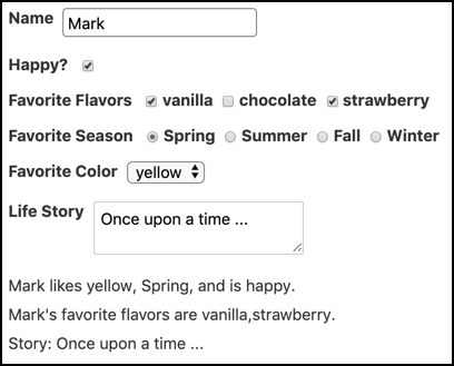
Here is an implementation that uses a single Svelte component. Note the use of bind: in several places.
<script>
  const colors = ['red', 'orange', 'yellow', 'green', 'blue', 'purple'];
  const flavors = ['vanilla', 'chocolate', 'strawberry'];
  const seasons = ['Spring', 'Summer', 'Fall', 'Winter'];
  let favoriteColor = '';
  let favoriteFlavors = [];
  let favoriteSeason = '';
  let happy = true;
  let name = '';
  let story = '';
</script>

<style>
  div {
    margin-bottom: 10px;
  }

  input,
  select {
    border: solid gray 1px;
    border-radius: 4px;
    padding: 4px;
  }

  input[type='checkbox'],
  input[type='radio'] {
    margin-left: 5px;
  }

  label {
    display: inline-block;
    font-weight: bold;
    margin-right: 5px;
    vertical-align: top;
  }
</style>

<div class="form">
  <div>
    <label>Name</label>
    <input type="text" bind:value={name} />
  </div>
  <div>
    <label>Happy?</label>
    <!-- For checkboxes, bind to the "checked" property rather than "value". -->
    <input type="checkbox" bind:checked={happy} />
  </div>
  <div>
    <label>Favorite Flavors</label>
    {#each flavors as flavor}
    <label>
      <!-- Using "bind:group" with a set of related checkboxes
           makes the value an array of strings. -->
      <input type="checkbox" value={flavor} bind:group={favoriteFlavors} />
      {flavor}
    </label>
    {/each}
  </div>
  <div>
    <label>Favorite Season</label>
    {#each seasons as season}
    <label>
      <!-- Using "bind:group" with a set of related radio buttons
           makes the value a single string. -->
      <input type="radio" value={season} bind:group={favoriteSeason} />
      {season}
    </label>
    {/each}
  </div>
  <div>
    <label>Favorite Color</label>
    <!-- To change a select to a scrollable list
         that allows selecting multiple options,
         add the "multiple" attribute. -->
    <select bind:value={favoriteColor}>
      <option />
      {#each colors as color}
      <!-- <option> elements can have a "value" attribute
            and its value can be a string, number, or object. -->
      <option>{color}</option>
      {/each}
    </select>
  </div>
  <div>
    <label>Life Story</label>
    <textarea bind:value={story} />
  </div>

  <!-- This part just reports the variable values set by binds,
       but only if name has a value. -->
  {#if name}
  <div>
    {name} likes {favoriteColor}, {favoriteSeason},
    and is {happy ? 'happy' : 'unhappy'}.
  </div>
  <div>{name}'s favorite flavors are {favoriteFlavors}.</div>
  <div>Story: {story}</div>
  {/if}
</div>
In addition to binding to primitive variables, form elements can bind to object properties. User input then causes those objects to be mutated.
Binding Custom Props
Svelte can bind a child component prop to a variable in the parent component. This allows child components to change values of parent component variables.
For example, here is a parent component:
<script>
  import Child from './Child.svelte';
  let pValue = 1;
</script>

<div>pValue = {pValue}</div>
<Child bind:cValue={pValue} />
And here is the child component:
<script>
  export let cValue = '';
  const double = () => (cValue *= 2);
</script>

<div>cValue = {cValue}</div>
<button on:click={double}>Double</button>
When the button in the Child component is pressed, cValue is doubled, and that becomes the new value of pValue because it is bound to cValue.
Event Handling
Event handling is specified with the on:event-name attribute whose value is a function to invoke when the event is dispatched. The event name can be the name of a standard DOM event or a custom event. An event object is passed to the given function.
For example:
<!-- The function "handleClick" must be defined in the <script> section above. -->
<button on:click={handleClick}>Press Me</button>

<!-- This demonstrates inline event handling using an anonymous function.
     It just sets the variable "clicked" to the DOM element for the button. -->
<button on:click={event => clicked = event.target}>Press Me</button>
Multiple event handling functions can be specified for the same event, and each will be invoked when the event is dispatched.
For example:
<button on:click={doOneThing} on:click={doAnother}>Press Me</button>Event handlers can specify any number of event modifiers with vertical bars preceding modifier names.
For example:
<button on:click|once|preventDefault={handleClick}>Press Me</button>The supported modifiers are:
capture- This causes the handler function to be invoked only in the capture phase, not the default bubbling phase.
once- This removes the handler after the first occurrence of the event.
passive- This can improve scrolling performance. You can learn more here.
preventDefault- This prevents the default action for the event from occurring. For example, it can stop a form submission.
stopPropagation- This prevents subsequent handlers in the capture/bubbling flow from being invoked.
Omitting the event handling function from an on: attribute is a shorthand to forward events up to the parent component.
For example, suppose part of the component hierarchy is A > B > C, and C emits the event "foo." B can forward it up to A with <C on:foo />.
Note that the on: attribute has no value.
This approach can also be used to forward DOM events.
Components can dispatch events.
For example:
<script>
  import {createEventDispatcher} from 'svelte';

  // This must be called when the component is instantiated,
  // not conditionally or later.
  const dispatch = createEventDispatcher();

  function sendEvent() {
    // The data associated with the event can be a primitive or an object.
    // Event names should not contain dashes.
    dispatch('someEventName', optionalData);
  }
</script>
These events only go to the parent component. They do not automatically bubble farther up the component hierarchy.
Parent components use on: to listen for events from child components.
For example if the parent component defines the function handleEvent, it can register that function to be invoked when a Child component dispatches an event with a given name.
<Child on:someEventName={handleEvent} />
Lifecycle Functions
Svelte supports registering functions to be invoked when four specific events occur in the lifecycle of a component instance. These include:
- When it is mounted
- Before it is updated
- After it is updated
- When it is destroyed
The term mounted means that the component instance has been added to the DOM.
The term destroyed means that the component instance has been removed from the DOM.
To register functions for these events, import provided lifecycle functions from the svelte package.
import {afterUpdate, beforeUpdate, onDestroy, onMount} from 'svelte';Then call these functions, passing them a function to be called when the event occurs.
The most commonly used lifecycle function is onMount. One use is to move focus to a given form element. Another is to retrieve data needed by the component from a REST service.
Here's an example that moves focus.
<script>
  import {onMount} from 'svelte';
  let name = '';
  let nameInput;
  onMount(() => nameInput.focus());
</script>

<input bind:this={nameInput} bind:value={name} />
The attribute bind:this sets the variable specified as its value to a reference to the DOM element for the input. This is used in the function passed to onMount to move focus to the input.
To register a function to be called when a component is removed from the DOM, pass the function to onDestroy.
An alternative to using onDestroy to register a function to be called when a component instance is removed from the DOM is to return the function from the one registered with onMount. This approach is a bit like the useEffect hook in React, but differs in that functions passed to useEffect are run on both mount and updates.
Lifecycle functions can be called from helper functions. These can be defined in separate .js files, which allows them to be imported and used by multiple components. This is similar to defining custom React hooks.
It is recommended to name these helper functions starting with "on," similar to how React hook names start with "use."
Actions
Actions register a function to be called when a specific element is added to the DOM.
Actions are specified on elements with the attribute use:fnName={args}. The registered function is passed the DOM element and the arguments, if any. Omit ={args} if no arguments other than the element are needed.
This is somewhat related to the onMount lifecycle function, which registers a function to call when each instance of a component is added to the DOM. Actions are called when specific elements in a component are added to DOM.
For example:
<script>
  let name = '';
  const focus = element => element.focus();
</script>

<!-- The focus function is called when the
     input element is added to the DOM. -->
<input bind:value={name} use:focus />
Action functions can optionally return an object with update and destroy properties that are functions. This feature is not frequently used.
The update function is called every time an argument value changes. Of course this doesn't apply if there are no arguments.
The destroy function is called when the element is removed from DOM.
Context
Context provides an alternative to using props and stores (covered next) for making data in a component available in others. Context data can only be accessed in descendant components.
To define a context in a component, import the setContext function and call it, supplying a context key and the value.
For example:
import {setContext} from 'svelte';

// Must be called during component instantiation.
setContext('favorites', {color: 'yellow', number: 19});
To use context in a descendant component, import the getContext function and call it, supplying a context key. This gets the context value from the closest ancestor component that has defined a context with that key.
For example:
import {getContext} from 'svelte';

// Must be called during component instantiation.
const favorites = getContext('favorites');
Context keys can be any kind of value, not just strings.
Context values can be any kind of value, including functions and objects with methods that can be called by descendant components.
If a component that has created context calls setContext again with the same key but a different value, descendant components will not receive updates. They only see what is available during component initialization.
Unlike props and stores, context is not reactive.
Here's an example of using context to make data available in a descendant component.
<!-- In A.svelte -->
<script>
  import {setContext} from 'svelte';
  import B from './B.svelte';
  setContext('favorites', {color: 'yellow', number: 19});
</script>

<div>
  This is in A.
  <B />
</div>
<!-- In B.svelte -->
<script>
import C from './C.svelte';
</script>
<div>
This is in B.
<C />
</div><!-- In C.svelte -->
<script>
import {getContext} from 'svelte';
const {color, number} = getContext('favorites');
</script>
<div>
This is in C.
<div>favorite color is {color}</div>
<div>favorite number is {number}</div>
</div>This renders the following:
This is in A.
This is in B.
This is in C.
favorite color is yellow
favorite number is 19
Stores
Stores hold application state outside any component. They are an alternative to using props or context to make data available in components.
For stores that should be available to any component, define and export them in a file like src/stores.js and import them from that file wherever needed.
For stores that should be available only to descendants of a given component, define them in that component and pass them to descendants using props or context.
Svelte provides three kinds of stores.
- writable stores – These are the only kind that can be modified by components.
- readable stores – These handle computing their own data.
- derived stores – These derive data from the current values of other stores.
All of these have a subscribe method that returns a function to call to unsubscribe.
Custom stores can also be created. Their only requirement is to be an object with a properly implemented subscribe method. Here's an example.
Writable Stores
To create a writable store, call the writable function, which is defined in the svelte/store package. Pass an initial value and optionally a function that takes a set function. If supplied, this function can asynchronously determine a value for the store. For example, it can call a REST service and pass the value returned to set. This function is not called until the first component subscribes to the store.
In addition to the subscribe method, writable stores have the following methods:
set(newValue)- This sets a new value for the store.
update(fn)- This updates the store value based on the current value.
fnis a function that is passed the current value and returns the new value.
Here's an example of defining a writable store using just an initial value.
// In stores.js
import {writable} from 'svelte/store';

// The initial value is an empty array.
export const dogStore = writable([]);
Here's an example of defining a writable store using a function to determine the value.
// In stores.js
import {writable} from 'svelte/store';

export const dogStore = writable(initialValue, async set => {
  // Called when subscribe count goes from 0 to 1.
  // Compute initial value and pass to set function.
  const res = await fetch('/dogs');
  const dogs = await res.json();
  set(dogs);

  return () => {
    // Called when subscriber count goes to 0.
  };
});
It is possible to bind the value of a form element to a writable store. When the user changes the form element value, the store is updated.
<input bind:value={$someStore} />The $ prefix on store names is explained below.
Readable Stores
To create a readable store, call the readable function, which is defined in the svelte/store package.
As with writable stores, this is passed an initial value and optionally a function that takes a set function.
For example:
import {readable} from 'svelte/store';

export const dogStore = readable(
  [], // initial value
  set => {
    const res = await fetch('/dogs');
    const dogs = await res.json();
    set(dogs);
    // Can return a cleanup function here.
  }
);
The set function can use setInterval to continuously change the value.
Using Stores
To begin using a store, get access to it in one of these ways:
- Accept it as a prop.
- Get it from a context.
- Import it from a
.jsfile (for global scopes).
There are two ways to get the value from a store:
- Call the
subscribemethod on it (somewhat verbose). - Use the auto-subscription shorthand (usually preferred).
Here's an example of using the subscribe method.
<script>
  import {onDestroy} from 'svelte';
  import {dogStore} from './stores.js';
  let dogs;
  const unsubscribe = dogStore.subscribe(value => (dogs = value));
  onDestroy(unsubscribe);
</script>

<!-- Use dogs in HTML. -->
Here's an example of using auto-subscription.
All variables whose names begin with $ must be stores. With this approach components automatically subscribe to stores when first used and unsubscribe when the component is destroyed.
<script>
  import {dogStore} from './stores.js';
</script>

<!-- Use $dogStore in HTML. -->
Here's an example of making changes to a writable store.
Components that subscribe to the store will see the changes.
<script>
  import {dogStore} from './stores.js';
  import Child from './Child.svelte';

  const dog = $dogStore;

  function changeDog() {
    // Approach #1 - create new object
    //dogStore.set({age: 2, breed: 'GSP', name: 'Oscar'});

    // Approach #2 - modify and reuse object
    dog.age = 2;
    dog.breed = 'GSP';
    dog.name = 'Oscar';
    dogStore.set(dog);
  }
</script>

<h1>Store Demo</h1>
<Child />
<button on:click={changeDog}>Change Dog</button>
Here's an example of getting changes from a store using $ references in the HTML.
<script>
  import {dogStore} from './stores.js';
</script>

<div>
  {$dogStore.name} is a {$dogStore.breed} that is {$dogStore.age} years old.
</div>
Here's the same thing, but getting the data from the store in JavaScript code.
<script>
  import {dogStore} from './stores.js';

  // Parens are needed here so it knows the
  // open curly brace is not the the start of a block.
  $: ({age, breed, name} = $dogStore);
</script>
<div>{name} is a {breed} that is {age} years old.</div>
Module Context
To run JavaScript code in a component source file only once instead of once for each component instance created, include the code in a script tag that specifies module context.
<script context="module">
  ...
</script>
When a script tag doesn't specify its context, it is instance context.
Both kinds of script tags, instance and module context, can appear in a component source file.
Values can be exported from both contexts. A default export cannot be specified because the component itself automatically becomes the default export.
The module context can declare variables and define functions. These are accessible in the instance context of all instances of the component, but they are not reactive. The component won't rerender when they change. This allows sharing data between all instances.
Instance context variables and functions are not accessible in the module context.
Note that it is not important to move functions that don't access component state to the module context because (from the Svelte API docs) "Svelte will hoist any functions that don't depend on local state out of the component definition." However, one reason to put functions in module context is so they can be exported and called from outside.
Batched DOM Updates
Component state is invalidated by changing the values of top-level component variables.
From the Svelte documentation, "When you invalidate component state in Svelte, it doesn't update the DOM immediately. Instead, it waits until the next microtask to see if there are any other changes that need to be applied, including in other components. Doing so avoids unnecessary work and allows the browser to batch things more effectively."
The tick function "returns a promise that resolves as soon as any pending state changes have been applied to the DOM (or immediately, if there are no pending state changes)."
This can be used to make additional state change after DOM updates have been applied.
<script>
  import {tick} from 'svelte';
  ...
  // Make some state changes.

  // The following prevents batching of updates
  // that occur after call to tick.
  await tick();

  // Make more state changes after the DOM updates.
  ...
</script>
Calling await tick() is also useful in tests to wait for a change to be processed before testing for the effect.
Animation
Svelte provides many features that make it easy to add animation to elements. The following is a list of some of the functions and transition values that are provided.
The svelte/animate package provides the flip function.
The svelte/motion package provides the spring and tweened functions.
The svelte/transition package provides the crossfade function and the transition values draw (for SVG elements), fade, fly, scale, and slide.
Also see the svelte/easing package that provides easing functions that control the rate of animation changes over time.
Here's a basic animation example that causes a list item to fade in when mounted and fade out when destroyed.
<script>
  import {fade} from 'svelte/transition';
</script>

<li transition:fade>
  <!-- some content -->
</li>
Custom animations can be created. Here's an example.
Components can listen for events to know when a transition starts and ends. This is done by listening for the following events:
introstartandintroendoutrostartandouttroend
Special Elements
Svelte supports several special elements that have the form <svelte:name props>. These are summarized below.
<svelte:component this={expression} optionalProps>- This renders the component specified by
expression. Ifexpressionis falsy it renders nothing. The optional props are passed to the component that is rendered. <svelte:self props>- This allows a component to render an instance of itself. It supports recursive components and is needed because a component cannot import itself.
<svelte:window on:eventName={handler}>- This registers a function to be called when a given event is dispatched by the DOM
windowobject. One example is theresizeevent. <svelte:window bind:propertyName={variable}>- This binds a variable to a window property. One example is
innerWidth. <svelte:body on:eventName={handler}>- This registers a function to be called when a given event is dispatched by the DOM
bodyelement. Examples includemouseEnterandmouseLeave. <svelte:head>elements</svelte:head>- This inserts elements in the
headelement of the DOM document. Examples include insertinglinkandscripttags. <svelte:options option={value} />- This is placed at the top of a
.sveltefile, not inside ascripttag. It specifies compiler options including:
immutable- This means props will be treated as immutable, which provides an optimization.
The default value isfalse. Being immutable means parent components will create new objects for object props rather than modify properties of existing objects. This allows Svelte to determine whether a prop has changed by comparing object references rather than object properties.
When this option is set totrue, if a parent component modifies object properties of a child component, the child will not detect the change and will not re-render. accessors- This adds getter and setter methods for the component props. The default is false. These can be useful when Svelte components are compiled to custom elements that are used in non-Svelte apps.
namespace="value"- This specifies the namespace of the component. One use is for SVG components which use a namespace of
svg. tag="value"- This specifies a name to use when a Svelte component is compiled as a custom element. It allows Svelte components to be used as custom elements in non-Svelte apps.
Debugging
Use @debug to break when given variables change and output their values in the devtools console.
Place this at the top of the HTML section, not inside a <script> tag.
For example:
{@debug var1, var2, var3}The variables being watched can have any kind of value, including objects.
To break when any state changes, omit the variable names.
{@debug}ESLint
ESLint bills itself as the "pluggable linting utility for JavaScript and JSX." It can report many syntax errors and potential run-time errors. It can also report deviations from specified coding guidelines.
To install everything needed to use ESLint in a Svelte project, enter npm install -D name where name is:
eslinteslint-plugin-svelte3eslint-plugin-import
Create the file .eslintrc.json file with the following content:
{
  "env": {
    "browser": true,
    "es6": true,
    "jest": true,
    "node": true
  },
  "extends": ["eslint:recommended", "plugin:import/recommended"],
  "globals": {
    "cy": "readonly"
  },
  "overrides": [
    {
      "files": ["**/*.svelte"],
      "processor": "svelte3/svelte3"
    }
  ],
  "parserOptions": {
    "ecmaVersion": 2019,
    "sourceType": "module"
  },
  "plugins": ["import", "svelte3"],
  "rules": {
    "no-console": "off"
   }
}
Add the following npm script to package.json:
"lint": "eslint --fix --quiet src --ext .js,.svelte",To run ESLint, enter npm run lint.
For more information on Svelte-specific ESLint options, see https://github.com/sveltejs/eslint-plugin-svelte3.
Prettier
Prettier bills itself as an "opinionated JavaScript formatter." It supports many languages and language features including ES2017, TypeScript, JSON, HTML, CSS, LESS, SCSS, JSX, Vue, and Markdown.
To install everything needed to use Prettier in a Svelte project, enter npm install -D name where name is:
prettierprettier-plugin-svelte
The Svelte ESLint plugin enforces the section order of <script>, <style>, and HTML.
Add the following npm script to package.json:
"format": "prettier --write '{public,src}/**/*.{css,html,js,svelte}'",To run Prettier, enter npm run format.
Todo App
Let's walk through the implementation of a simple Todo app to pull together the most important Svelte concepts. This code can be found in GitHub at https://github.com/mvolkmann/svelte-todo.
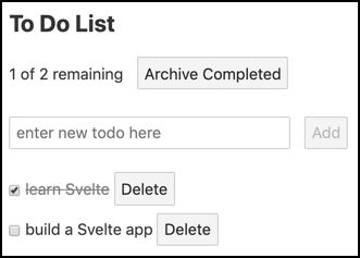
To add a new todo, enter its text in the input and press the "Add" button or the enter key.
To toggle a todo between done and not done, click the checkbox to its left. Note that the "remaining" text near the top shows the number of todos that are not currently checked and the total number of todos.
To delete a todo, click the "Delete" button to its right.
To archive all the checked todos, click the "Archive Completed" button. They aren't really archived in this version of the app. They are just deleted.
Here is the file src/main.js that kicks off the app by rendering a TodoList component in the document body.
import TodoList from './TodoList.svelte';

const app = new TodoList({target: document.body});

export default app;
Here is the code for the Todo component in the file src/Todo.svelte.
It is a list item that contains:
- The text of the todo
- A checkbox
- A "Delete" button
It takes one prop named "todo" that holds the text of a todo.
When the checkbox is toggled it dispatches a "toggleDone" event.
When the "Delete" button is pressed it dispatches a "delete" event.
<script>
  import {createEventDispatcher} from 'svelte';
  const dispatch = createEventDispatcher();
  export let todo; // the only prop
</script>

<style>
  /* This draws a line through the text
     of todos that are marked as done. */
  .done-true {
    color: gray;
    text-decoration: line-through;
  }
  li {
    margin-top: 5px;
  }
</style>

<li>
  <input
    type="checkbox"
    checked={todo.done}
    on:change={() => dispatch('toggleDone')}
  />
  <span class={'done-' + todo.done}>{todo.text}</span>
  <button on:click={() => dispatch('delete')}>Delete</button>
</li>
Here is the code for the TodoList component in the file src/TodoList.svelte.
After what you have learned about Svelte so far, this code should be mostly self-explanatory.
<script>
  import Todo from './Todo.svelte';

  let lastId = 0;

  // This creates a todo object.
  const createTodo = (text, done = false) => ({id: ++lastId, text, done});

  let todoText = '';

  // The app starts with two todos having already been created.
  let todos = [
    createTodo('learn Svelte', true),
    createTodo('build a Svelte app')
  ];

  let uncompletedCount = 0;

  // This is a "reactive declaration".
  // It ensures that uncompletedCode is updated
  // any time the todos array is modified.
  $: uncompletedCount = todos.filter(t => !t.done).length;

  // This is another "reactive declaration".
  // In ensures that status is updated any time
  // uncompletedCount or the length of the todos array changes.
  $: status = `${uncompletedCount} of ${todos.length} remaining`;

  // This creates and adds a new todo.
  function addTodo() {
    // Recall why this must use concat instead of push.
    todos = todos.concat(createTodo(todoText));
    todoText = ''; // clears the input
  }

  // This just deletes all todos that are marked as done.
  const archiveCompleted = () => (todos = todos.filter(t => !t.done));

  // This deletes a specific todo.
  const deleteTodo = todoId => (todos = todos.filter(t => t.id !== todoId));

  // This toggles the done state of a given todo.
  function toggleDone(todo) {
    const {id} = todo;
    todos = todos.map(t => (t.id === id ? {...t, done: !t.done} : t));
  }
</script>

<style>
  button {
    margin-left: 10px;
  }

  /* This removes the bullets from a bulleted list. */
  ul.unstyled {
    list-style: none;
    margin-left: 0;
    padding-left: 0;
  }
</style>

<div>
  <h2>To Do List</h2>
  <div>
    {status}
    <button on:click={archiveCompleted}>Archive Completed</button>
  </div>
  <br />
  <!-- We don't want to actually submit the form.
       Using a form makes it so pressing the enter key
       triggers the "Add" button. -->
  <form on:submit|preventDefault>
    <input
      type="text"
      size="30"
      autofocus
      placeholder="enter new todo here"
      bind:value={todoText}
    />
    <button disabled={!todoText} on:click={addTodo}>
      Add
    </button>
  </form>
  <ul class="unstyled">
    {#each todos as todo}
      <Todo
        todo={todo}
        on:delete={() => deleteTodo(todo.id)}
        on:toggleDone={() => toggleDone(todo)}
      />
    {/each}
  </ul>
</div>
Unit Tests
Unit tests for Svelte components can be implemented using Jest. In addition, use of "Svelte Testing Library" is recommended. It works with Jest to simplify writing unit tests for Svelte components.
Explaining the details of these testing tools is beyond the scope of this article, but example test code is provided below. To learn more about these tools visit https://jestjs.io/ and https://testing-library.com/.
To install everything needed, enter npm install -D name where name is:
@babel/core@babel/preset-env@testing-library/sveltebabel-jestjestjest-transform-svelte
Create the file babel.config.js with the following contents:
module.exports = {
  presets: [
    [
      '@babel/preset-env',
      {
        targets: {
          node: 'current'
        }
      }
    ]
  ]
};
If targets.node is not set as shown above, the error message "regenerator-runtime not found" will be displayed when the tests are run.
Create the file jest.config.js with the following contents:
module.exports = {
  transform: {
    '^.+  .js$': 'babel-jest',
    '^.+  .svelte$': 'jest-transform-svelte'
  },
  moduleFileExtensions: ['js', 'svelte'],
  bail: false,
  verbose: true
};
Setting bail to false means that Jest should not exit a test suite when one of its tests fails.
Setting verbose to true causes Jest to show the result of each test, rather than just a summary of the results for each test suite.
Add the following npm script to package.json:
"test": "jest --watch src",To run the unit tests, enter npm test.
Here is code for testing the Todo component in the file src/Todo.spec.js:
import {cleanup, render} from '@testing-library/svelte';

import Todo from './Todo.svelte';

describe('Todo', () => {
  const text = 'buy milk';
  const todo = {text};

  // Unmounts any components mounted in the previous test.
  afterEach(cleanup);

  test('should render', () => {
    const {getByText} = render(Todo, {props: {todo}});
    const checkbox = document.querySelector('input[type="checkbox"]');
    expect(checkbox).not.toBeNull(); // found checkbox
    expect(getByText(text)); // found todo text
    expect(getByText('Delete')); // found Delete button
  });

  // There is no easy way to test that events are fired
  // when the checkbox state is changed
  // or when the "Delete" button is pressed.
  // These are covered by tests in TodoList.spec.js.
});
Here is code for testing the TodoList component in the file src/TodoList.spec.js:
import {tick} from 'svelte';
import {cleanup, fireEvent, render, wait} from '@testing-library/svelte';

import TodoList from './TodoList.svelte';

describe('TodoList', () => {
  const PREDEFINED_TODOS = 2;

  afterEach(cleanup);

  // This is used by many of the test functions below.
  function expectTodoCount(count) {
    return wait(() => {
      // Each todo has an <li> root element.
      const lis = document.querySelectorAll('li');
      expect(lis.length).toBe(count);
    });
  }

  test('should render', async () => {
    const {getByText} = render(TodoList);
    expect(getByText('To Do List'));
    expect(getByText('1 of 2 remaining'));
    expect(getByText('Archive Completed')); // button
    await expectTodoCount(PREDEFINED_TODOS);
  });

  test('should add a todo', async () => {
    const {getByTestId, getByText} = render(TodoList);

    const input = getByTestId('todo-input');
    const value = 'buy milk';
    fireEvent.input(input, {target: {value}});
    fireEvent.click(getByText('Add'));

    await expectTodoCount(PREDEFINED_TODOS + 1);
    expect(getByText(value));
  });

  test('should archive completed', async () => {
    const {getByText} = render(TodoList);
    fireEvent.click(getByText('Archive Completed'));
    await expectTodoCount(PREDEFINED_TODOS - 1);
    expect(getByText('1 of 1 remaining'));
  });

  test('should delete a todo', async () => {
    const {getAllByText, getByText} = render(TodoList);
    const text = 'learn Svelte'; // first todo
    expect(getByText(text));

    const deleteBtns = getAllByText('Delete');
    fireEvent.click(deleteBtns[0]); // deletes first todo
    await expectTodoCount(PREDEFINED_TODOS - 1);
  });

  test('should toggle a todo', async () => {
    const {container, getByText} = render(TodoList);
    const checkboxes = container.querySelectorAll('input[type="checkbox"]');

    fireEvent.click(checkboxes[1]); // second todo
    await tick();
    expect(getByText('0 of 2 remaining'));

    fireEvent.click(checkboxes[0]); // first todo
    await tick();
    expect(getByText('1 of 2 remaining'));
  });
});
End-to-End Tests
End-to-end tests for Svelte applications can be implemented using Cypress. Explaining the details of Cypress is beyond the scope of this article, but example test code is provided below.
To learn more about Cypress, visit https://www.cypress.io/.
To install Cypress, enter npm install -D cypress.
Add the following npm scripts to package.json:
"cy:open": "cypress open",
"cy:run": "cypress run",
To launch the Cypress test tool in interactive mode, enter npm run cy:open. This also creates a cypress directory, if it doesn't already exist, with the following subdirectories:
fixtures- These can hold data used by tests. The data is typically in
.jsonfiles that are imported into tests. integration- Your test files go here, either at the top of this directory or in subdirectories.
plugins- These extend the functionality of Cypress. For examples, see https://github.com/bahmutov/cypress-svelte-unit-test. Cypress automatically runs the code in the
index.jsfile in this directory before running each spec file. screenshots- This holds screenshots produced by calling
cy.screenshot(). These are useful when debugging tests. support- Files here add custom Cypress commands, making them available in tests. Cypress automatically runs the code in the
index.jsfile in this directory before running each spec file.
These directories are populated with sample files, all of which can be deleted.
Create test files under the cypress/integration direction with extensions of .spec.js.
To run the end-to-end tests:
- Start the application server with
npm run dev - Enter
npm run cy:open - Press the "Run all specs" button in the upper-right corner of the Cypress tool
This opens a browser window where all the tests are run.
When finished running the tests, close this browser window and the Cypress tool.
Here is code for end-to-end tests of the Todo application in the file cypress/integration/TodoList.spec.js.
const baseUrl = 'http://localhost:5000/';

describe('Todo app', () => {
  it('should add todo', () => {
    cy.visit(baseUrl);
    cy.contains('1 of 2 remaining');
    // The "Add" button should be disabled until text is entered.
    cy.contains('Add')
      .as('addBtn')
      .should('be.disabled');

    // Enter todo text.
    const todoText = 'buy milk';
    cy.get('[data-testid=todo-input]')
      .as('todoInput')
      .type(todoText);

    cy.get('@addBtn').should('not.be.disabled');
    cy.get('@addBtn').click();

    cy.get('@todoInput').should('have.value', '');
    cy.get('@addBtn').should('be.disabled');
    cy.contains(todoText);
    cy.contains('2 of 3 remaining');
  });

  it('should toggle done', () => {
    cy.visit(baseUrl);
    cy.contains('1 of 2 remaining');

    // Find the first checkbox and toggle it.
    cy.get('input[type=checkbox]')
      .first()
      .as('cb1')
      .click();
    cy.contains('2 of 2 remaining');

    // Toggle the same checkbox again.
    cy.get('@cb1').check();
    cy.contains('1 of 2 remaining');
  });

  it('should delete todo', () => {
    cy.visit(baseUrl);
    cy.contains('1 of 2 remaining');

    const todoText = 'learn Svelte'; // first todo
    cy.contains('ul', todoText);

    // Click the first "Delete" button.
    cy.contains('Delete').click();
    cy.contains('ul', todoText).should('not.exist');
    cy.contains('1 of 1 remaining');
  });

  it('should archive completed', () => {
    cy.visit(baseUrl);

    const todoText = 'learn Svelte'; // first todo
    cy.contains('ul', todoText);

    // Click the "Archive Completed" button.
    cy.contains('Archive Completed').click();
    cy.contains('ul', todoText).should('not.exist');
    cy.contains('1 of 1 remaining');
  });
});
To rerun the tests, click the circular arrow button near the top of the browser window.
To aid in debugging, add console.log calls in the application code and open the devtools console in the browser window where the tests are running.
Tests will automatically rerun when changes are saved to application source files or test files.
To launch the Cypress test tool in command-line mode, enter npm run cy:run. This outputs test results in the terminal window, records a video of the test run, and outputs the file path of the video. Double-click the video file to watch it.
Related Tools
The following is a list of Svelte-related tools that are worthy of investigating.
- Svelte VS Code extension
- Sapper – https://sapper.svelte.dev/
This is an "application framework powered by Svelte." A Sapper is a soldier responsible for tasks such as building and repairing roads and bridges, laying and clearing mines, etc. Sapper is similar to Next and Gatsby. It provides routing, server-side rendering, and code splitting. - Svelte Native – https://svelte-native.technology/
This is a community-drive project that supports implementing native mobile apps using Svelte. It is based on nativescript-vue. - Svelte GL – https://github.com/Rich-Harris/svelte-gl
This is an in-work Svelte version of the Three.js 3D graphics library. - Storybook with Svelte – https://storybook.js.org/docs/guides/guide-svelte/
Storybook is a tool for demonstrating and experimenting with web UI components.
Conclusion
There you have it! Svelte is a worthy alternative to the currently popular options of React, Vue, and Angular. It has many benefits, including small bundle sizes, simple component definitions, easy state management, and reactivity without a virtual DOM.
Thanks so much to Charles Sharp and Kristin Kroeger for reviewing this article!
Please send corrections and feedback to mark@objectcomputing.com.
Software Engineering Tech Trends (SETT) is a regular publication featuring emerging trends in software engineering.
