DIALOGS WITH STYLE: THE NEW HTML <dialog> ELEMENT
By Mark Volkmann, OCI Partner and Principal Software Engineer
May 2019
The <dialog> element was added to HTML in version 5.2. It provides a way to define dialogs that are initially closed. These can be styled with CSS.
The DOM interface that implements this functionality is HTMLDialogElement. It supports three methods:
- The
showModalmethod opens the dialog as a modal, which means the user cannot interact with elements outside it. - The
showmethod opens the dialog as a non-modal, which means the user can interact with elements outside it. - The
closemethod closes the dialog.
Past Alternatives
Before this addition, there were two primary options for implementing dialogs in web applications.
First, the JavaScript functions alert, confirm, and prompt can be used to display simple dialogs. These are not desirable because they cannot be made to match the styles of web applications that use them.
Second, dialogs can be simulated with <div> tags that have a higher CSS z-index than the page. There are many libraries for many web frameworks that take this approach. One example is react-modal.
These approaches are no longer needed now that we can use the <dialog> element.
Browser Support
As of January 25, 2019, the <dialog> element was supported by Chrome, Firefox, and Opera, but not by Edge, Internet Explorer, or Safari. However, there is a polyfill named "dialog-polyfill" from the Google Chrome team that allows it to work in all of these browsers. It is available at https://github.com/GoogleChrome/dialog-polyfill.
Polyfill Install
If Node.js is not installed, browse https://nodejs.org, download the "LTS" or "Current" version, and run the installer.
Install the polyfill by entering npm install dialog-polyfill.
Copy the files dialog-polyfill.css and dialog-polyfill.js from the node_modules/dialog-polyfill directory into the directory where index.html resides in the web application that wishes to use the <dialog> element. Typically this is the public directory.
Example Usage in Plain JavaScript
Here is an example of using the <dialog> element without using a web app framework.
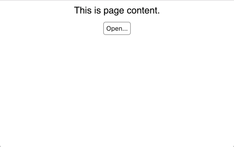
Before the dialog is opened, the page has the following content:
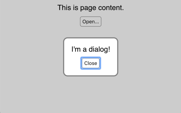
After the dialog is opened, the page has the following content:
index.html
- <!DOCTYPE html>
- <html lang="en">
- <head>
- <link rel="stylesheet" href="dialog-polyfill.css" />
- <link rel="stylesheet" href="dialog-demo.css" />
- <script src="dialog-polyfill.js"></script>
- <script src="dialog-demo.js"></script>
- <title>Dialog Demo</title>
- </head>
- <body>
- <!-- This defines the content of the dialog which
- can be any HTML, including form elements. -->
- <dialog>
- I'm a dialog!
- <!-- This renders a "Close" button that will
- close the dialog when it is clicked. -->
- <form method="dialog"><input type="submit" value="Close" /></form>
- </dialog>
-
- <div>This is the page content.</div>
-
- <!-- Pressing this button causes the dialog to open. -->
- <button onClick="dialog.showModal()">Open...</button>
- </body>
- </html>
dialog-demo.js
- // Tell ESLint that about global variables.
- /* global dialogPolyfill: false */
-
- // eslint-disable-next-line no-unused-vars
- let dialog; // accessed in index.html
-
- window.onload = () => {
- dialog = document.querySelector('dialog');
- dialogPolyfill.registerDialog(dialog);
- };
This is the CSS that styles the dialog and the buttons that open and close it.
dialog-demo.css
- body {
- font-family: sans-serif;
- text-align: center;
- }
-
- /* These are styles for buttons, including
- submit buttons used to close dialogs.
- The background-color and box-shadow styles
- must be specified in order to make the buttons
- look the same across various browser. */
- button,
- input[type='submit'] {
- background-color: white;
- border: solid gray 1px;
- border-radius: 4px;
- box-shadow: none;
- margin-top: 10px;
- padding: 4px;
- }
-
- /* These are the styles for the dialog */
- dialog {
- border: solid gray 2px;
- border-radius: 10px;
- }
-
- /* This is the style for outside the dialog
- when the dialog is displayed
- to make it clear that it is a "modal dialog" and
- the user cannot interact with anything outside it. */
- ::backdrop, /* for native <dialog> */
- dialog + .backdrop {
- /* for dialog-polyfill */
- /* a transparent shade of gray */
- background-color: rgba(0, 0, 0, 0.2);
- }
Example Usage in React
Here is an example of using the <dialog> element in a React application. It was created using create-react-app.
No knowledge of React is required to understand the example.
Edit this file and add the following lines inside the <head> element.
React public/index.html
<link rel="stylesheet" href="dialog-polyfill.css" />
<script src="dialog-polyfill.js"></script>
This is the entire content of App.js, including comments that explain the relevant parts.
React src/App.js
- // Tell ESLint that about global variables.
- /* global dialogPolyfill: false */
-
- import React, {Component} from 'react';
- import './App.css';
-
- class App extends Component {
- // This runs after the App component is rendered.
- componentDidMount() {
- // Find the dialog using a CSS selector
- // and save it for later.
- this.dialog = document.querySelector('dialog');
-
- // Register the dialog with the polyfill which is
- // required by browsers that lack native support.
- dialogPolyfill.registerDialog(this.dialog);
- }
-
- openDialog = () => {
- // This is what actually causes the dialog to open.
- // By default it will be centered on the page.
- this.dialog.showModal();
- };
-
- render() {
- return (
- <div className="App">
- <!-- This defines the content of the dialog which
- can be any HTML, including form elements. -->
- <dialog>
- I'm a dialog!
- <!-- This renders a "Close" button that will
- close the dialog when it is clicked. -->
- <form method="dialog">
- <input type="submit" value="Close" />
- </form>
- </dialog>
-
- <div>This is the page content.</div>
-
- <!-- Pressing this button causes the dialog to open. -->
- <button onClick={this.openDialog}>Open...</button>
- </div>
- );
- }
- }
-
- export default App;
React src/App.css
[The content of this file is the same as dialog-demo.css in the previous example.]Example Usage in React Using Hooks
Here is an example of using the <dialog> element in a reusable React component that uses the relatively new "hooks" feature.
React src/dialog/dialog.js
- /*global dialogPolyfill: false */
- import {node, object, string} from 'prop-types';
- import React, {useEffect} from 'react';
- import './dialog.css';
- /**
- * Creates a Dialog that can have a title and any content.
- * A ref must be passed via the `dialogRef` prop.
- * This is used by the caller to open and close the dialog.
- * The dialog is initially closed.
- *
- * To open the dialog as a modal, `dialogRef.current.showModal()`.
- * This does not allow interaction with elements outside the dialog.
- *
- * To open the dialog as a non-modal, `dialogRef.current.show()`.
- * This allows interaction with elements outside the dialog.
- *
- * To close the dialog, `dialogRef.current.close()`.
- *
- * @param {node} children - JSX to render in the body of the dialog
- * @param {object} dialogRef - a ref that will be set to refer to the dialog
- * @param {string} title - to display in dialog header
- */
- function Dialog({children, dialogRef, title}) {
- useEffect(() => {
- // Register the dialog with the polyfill which is
- // required by browsers that lack native support.
- dialogPolyfill.registerDialog(dialogRef.current);
- }, []); // only runs once.
- return (
- <dialog ref={dialogRef}>
- <header>
- <div className="title">{title}</div>
- <button className="close-btn" onClick={() => dialogRef.current.close()}>
- ✖
- </button>
- </header>
- <section className="body">{children}</section>
- </dialog>
- );
- }
- Dialog.propTypes = {
- children: node.isRequired,
- dialogRef: object.isRequired,
- title: string.isRequired
- };
- export default Dialog;
React src/dialog/dialog.css
- dialog {
- padding: 0;
- }
-
- dialog > header {
- background-color: white;
- border-bottom: solid gray 1px;
- display: flex;
- justify-content: space-between;
- padding: 10px;
- }
-
- dialog > header > .close-btn {
- border: none;
- color: gray;
- font-size: 24px;
- outline: none;
- }
-
- dialog > header > .title {
- color: $green;
- font-size: 24px;
- font-weight: bold;
- margin-right: 20px;
- }
-
- dialog > .body {
- padding: 10px;
- }
-
- ::backdrop, /* for native <dialog> */
- dialog + .backdrop /* for dialog-polyfill */ {
- /* a transparent shade of gray */
- background-color: rgba(0, 0, 0, 0.4);
- }
To use this React component in another functional component:
- import React, {useRef} from 'react';
- import Dialog from '../dialog/dialog';
-
- // Create a ref that will be set to a reference to the dialog.
- const dialogRef = useRef();
-
- // Render a dialog that will be initially closed.
- <Dialog dialogRef={dialogRef} title="some title">
- some content
- </Dialog>;
-
- // To open the dialog,
- dialogRef.current.showModal(); // or show() for non-modal
-
- // To close the dialog,
- dialogRef.current.close();
Example Usage in Vue
Here is an example of using the <dialog> element in a Vue application. It was created using the Vue CLI.
No knowledge of Vue is required to understand the example.
Edit this file and add the following lines inside the <head> element.
Vue public/index.html
<link rel="stylesheet" href="dialog-polyfill.css" />
<script src="dialog-polyfill.js"></script>
Modify the <template> and <script> sections to match the following:
Vue src/App.vue
- <template>
- <DialogDemo />
- </template>
-
- <script>
- import DialogDemo from './components/DialogDemo.vue';
-
- export default {
- name: 'app',
- components: {
- DialogDemo
- }
- };
- </script>
Create this file with the following content:
Vue src/components/DialogDemo.vue
- <template>
- <div>
- <dialog>
- I'm a dialog!
- <form method="dialog"><input type="submit" value="Close" /></form>
- </dialog>
- <div>This is page content.</div>
- <button @click="dialog.showModal()">Open...</button>
- </div>
- </template>
-
- <script>
- /* global dialogPolyfill: false */
- export default {
- name: 'DialogDemo',
- data() {
- return {dialog: Object};
- },
- mounted() {
- this.dialog = document.querySelector('dialog');
- dialogPolyfill.registerDialog(this.dialog);
- }
- };
- </script>
-
- <style>
- <!-- Add same CSS rules here as are found in `dialog-demo.css`.
- </style>
Summary
Even with the need to use a polyfill, the <dialog> element is very easy to use!
Software Engineering Tech Trends (SETT) is a regular publication featuring emerging trends in software engineering.
